Layout Scale Framer plugin
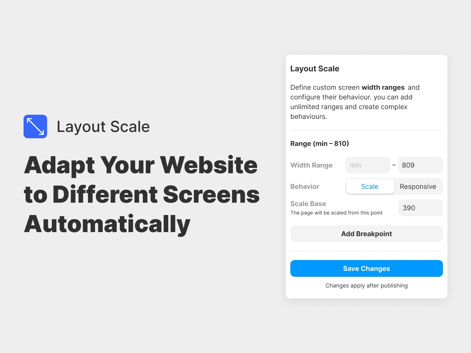
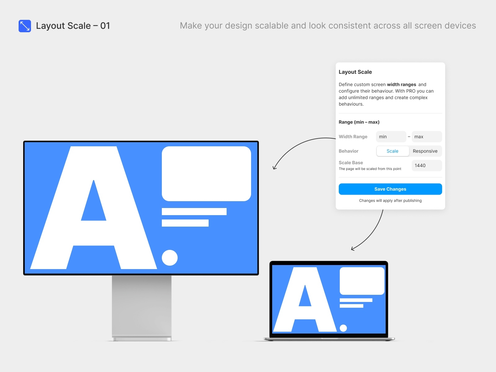
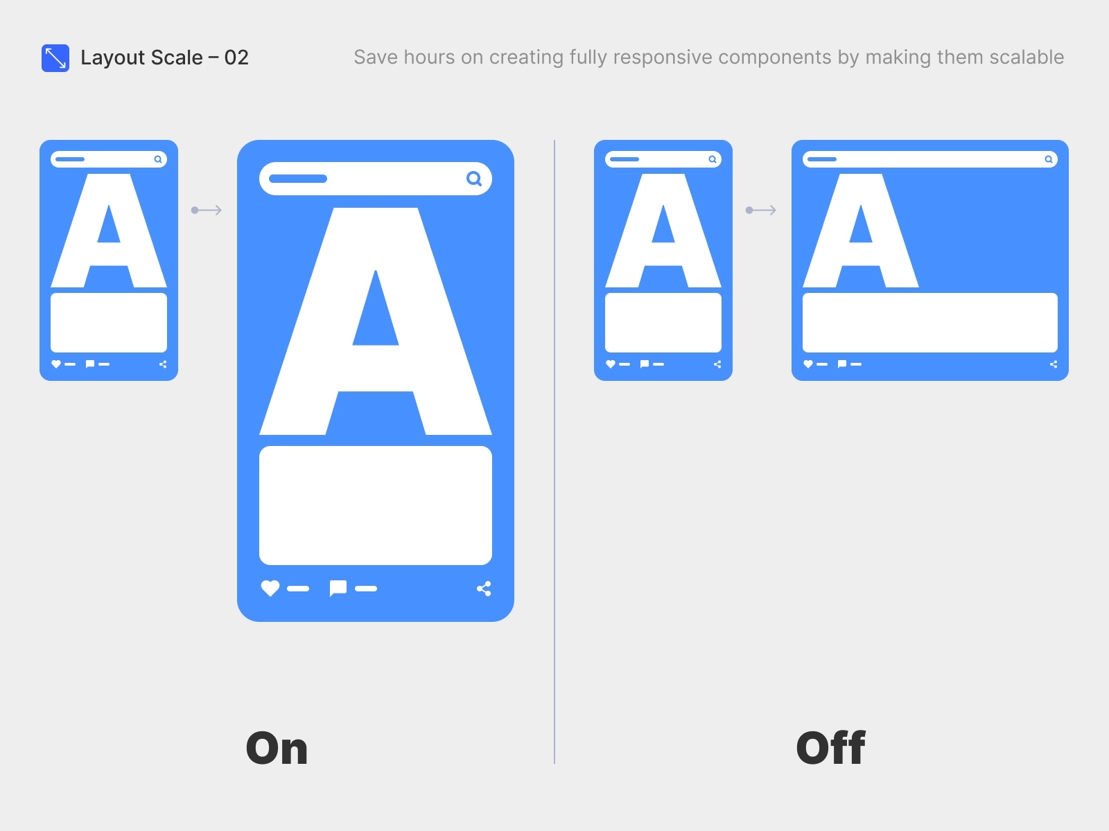
Scale Layout enhances Framer by enabling scalable design layouts, allowing you to effortlessly create websites that adapt to any device size.
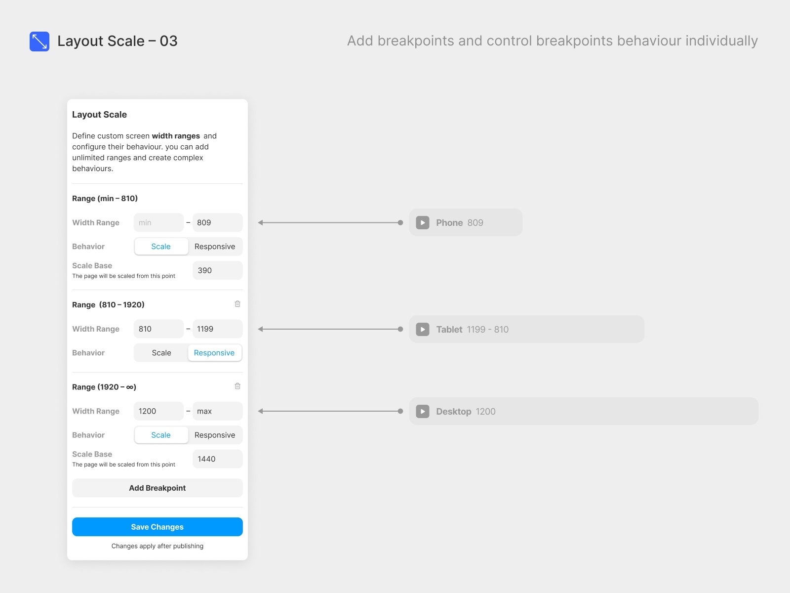
With the Pro version, you can define specific scaling behaviors for different breakpoints. Seamlessly scale layouts on mobile and ultra-wide screens, or switch to responsive design for small desktops, ensuring your site maintains its intended look and feel across all devices.
How to Use Scale Layout
- Set Up Breakpoints: Create at least the same number of breakpoints in Scale Layout as you have in your Framer project.
- Configure Scaling Behavior: For each breakpoint, use the “Scale Base” field to determine the reference width for proportional scaling based on the browser’s width.
- Example: If you set scaling behavior for your mobile breakpoint between “min” and “810” and specify a Base of 390, the layout will scale proportionally starting from 390px. Experiment with these values to find the ideal settings for your design.
- Preview in Browser: Scale Layout changes are only visible in a browser, not Framer's preview.
Note: “Min.” represents the minimal possible screen size. “Max.” represents the maximal possible screen size.